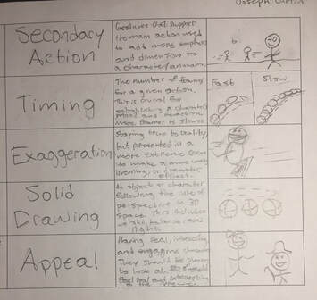
Principles of Animation
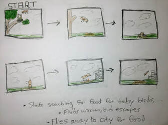
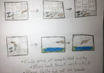
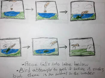
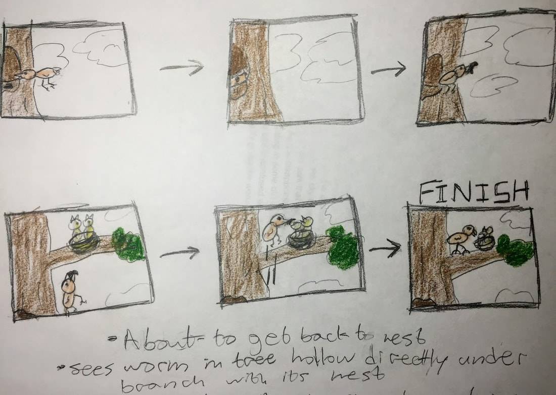
The Story A bird’s babies demand food from the adult bird in its nest. The bird swiftly flies down from the tree and into the city to search for food to bring home, but immediately faces a series of problems. It’s first stop was to check a patch of dirt for worms. The worm escaped by going back underground too far for the bird’s beak to reach causing the bird to nearly smash its beak into the ground. It was disappointed at first but moved on to the inner city to search for scraps of food like bread. It eventually finds a piece beneath a table and takes it in its beak. It flies away with the piece when it suddenly drops it while in the air. It falls into a lake that the bird happened to be over. As the piece fell, the bird chased it down when it splashed into the water. It went to try to get it back before it sank, but there is an animal in the water that lunges towards the bird with its mouth open. The bird escapes with perfect timing and slowly flies through the air carefully looking below for a different source of food. It lands in an empty area and begins to turn its head side to side for the chance of there being food nearby, but there is none in sight. The bird looks into the sky to realize that it has gotten late. It knows that it will not be able to continue in the dark that will soon come so goes back to its nest with no food for its babies. As it is disappointed and flying up to the nest after reaching the tree of its nest, a worm is sitting in some dirt inside of a tree hollow directly underneath the branch of the nest. The bird is confused why it didn’t see it in the first place or how the worm got there, but gladly grabs the worm in its beak seconds before giving it to its babies above. Storyboard
Research   1/2 Way DoneReflection - HalfwaySo far, I believe that the animation process has gone smoothly. I have finished around half of my stop motion and every other step that comes before it. My backgrounds and cutouts look nice, and animating them as of now has gone quickly as it is simply moving, switching out, and rotating each cut out piece in the proper places. I have incorporated many of the principles of animation as I had pre-planned including squash and stretch, follow through, overlapping action, anticipation, and more such as in the city and beginning scenes. Final Animation Video
|
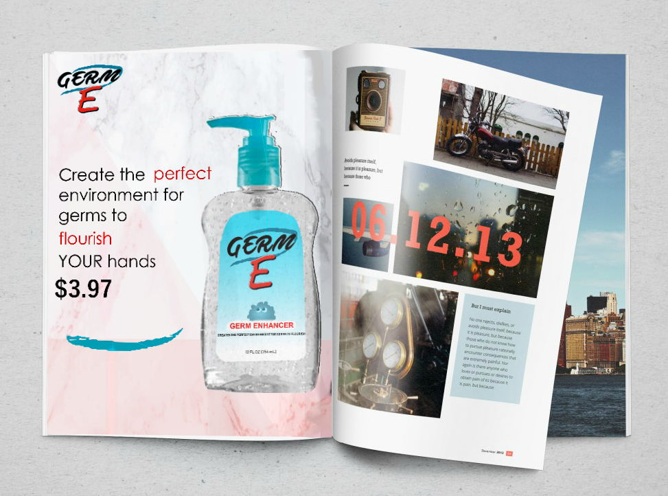
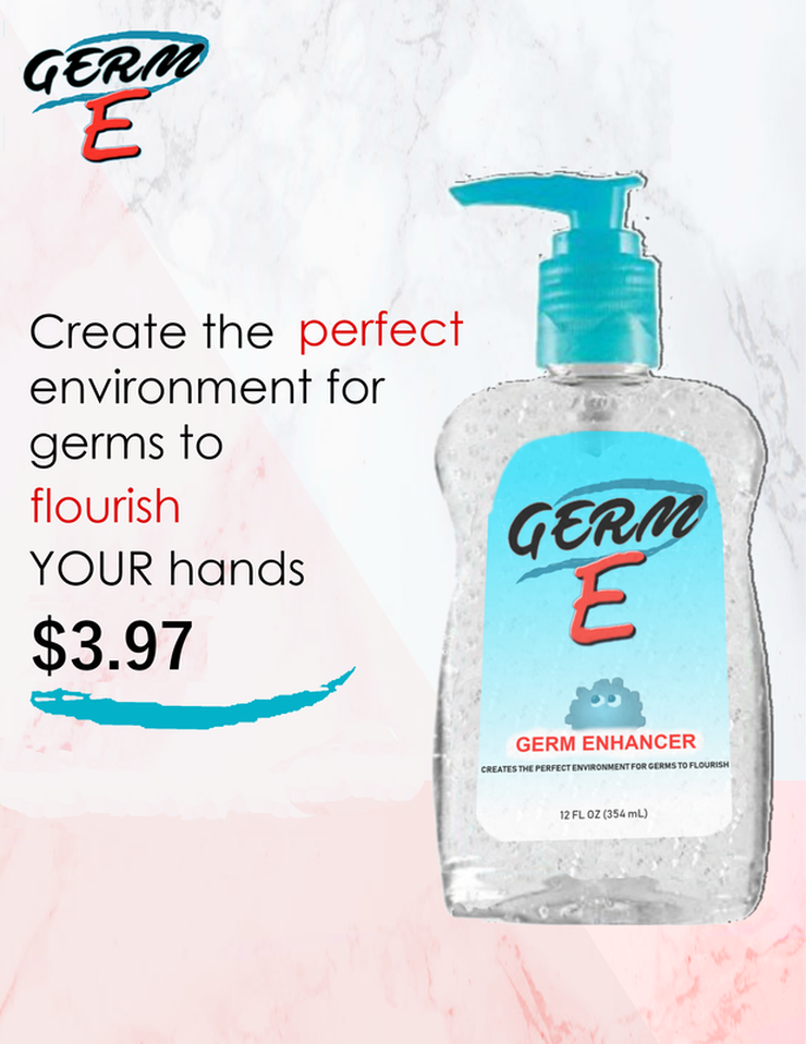
| Pros + The advertisements structure overall looks like a professional magazine ad would. The text is properly sized, and everything fits a color scheme of blue and red. The background works well by not being too complicated, although is more interesting than a completely solid background. | Cons - The price and its underline was placed in the wrong spot in the first image. There is some white where there shouldn't be around the outline of the top of the hand sanitizer container. |
Process: To make this advertisement, I began by making a background that would match the color scheme of the product I made, then placing the image of the product on top of it. I added a small drop shadow to make it stand out more on one side. I then added the text, logo, and additional underline beneath the price. Once this looked complete, I edited the advertisement into an image of an open magazine to show what it would look like inside of one as this is where the ad would be found.
 |  |
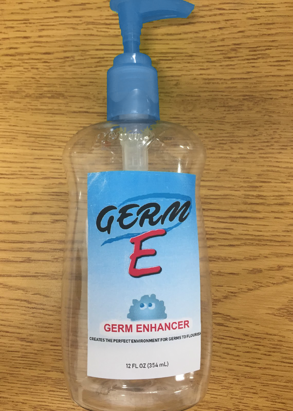 |  | 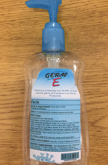 |
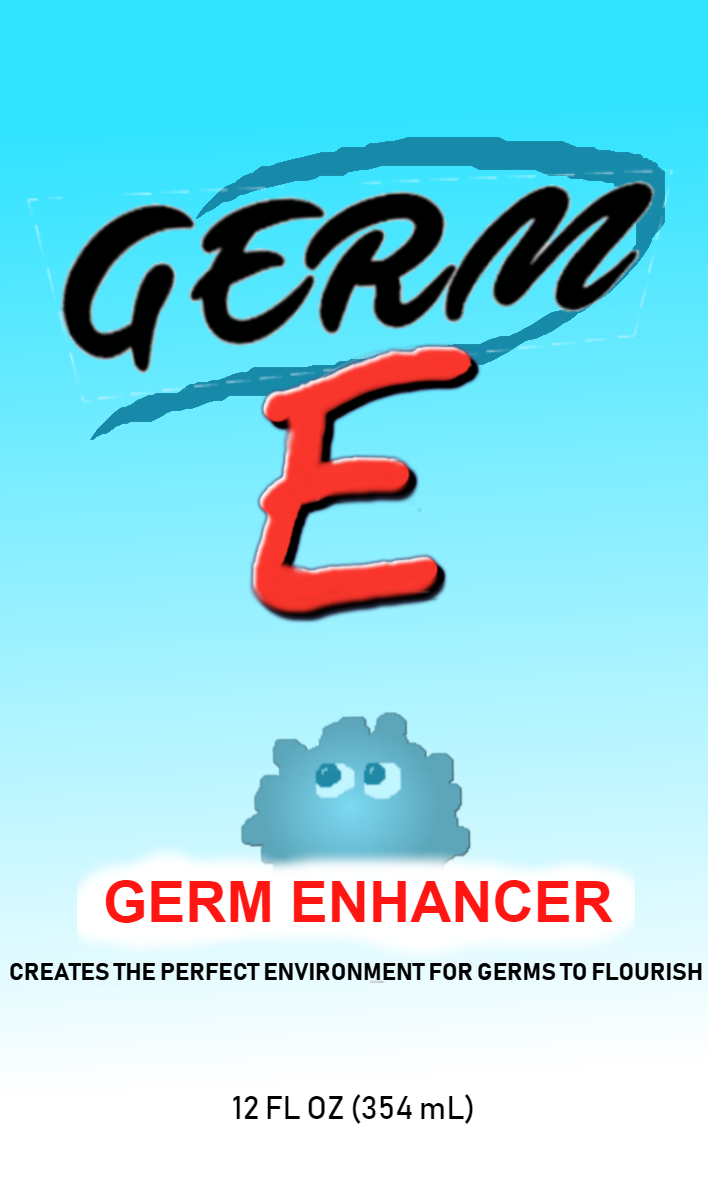
1. I picked this product due to the idea I had of creating the opposite of a real hand sanitizer product, and had an empty container to use for the physical piece.
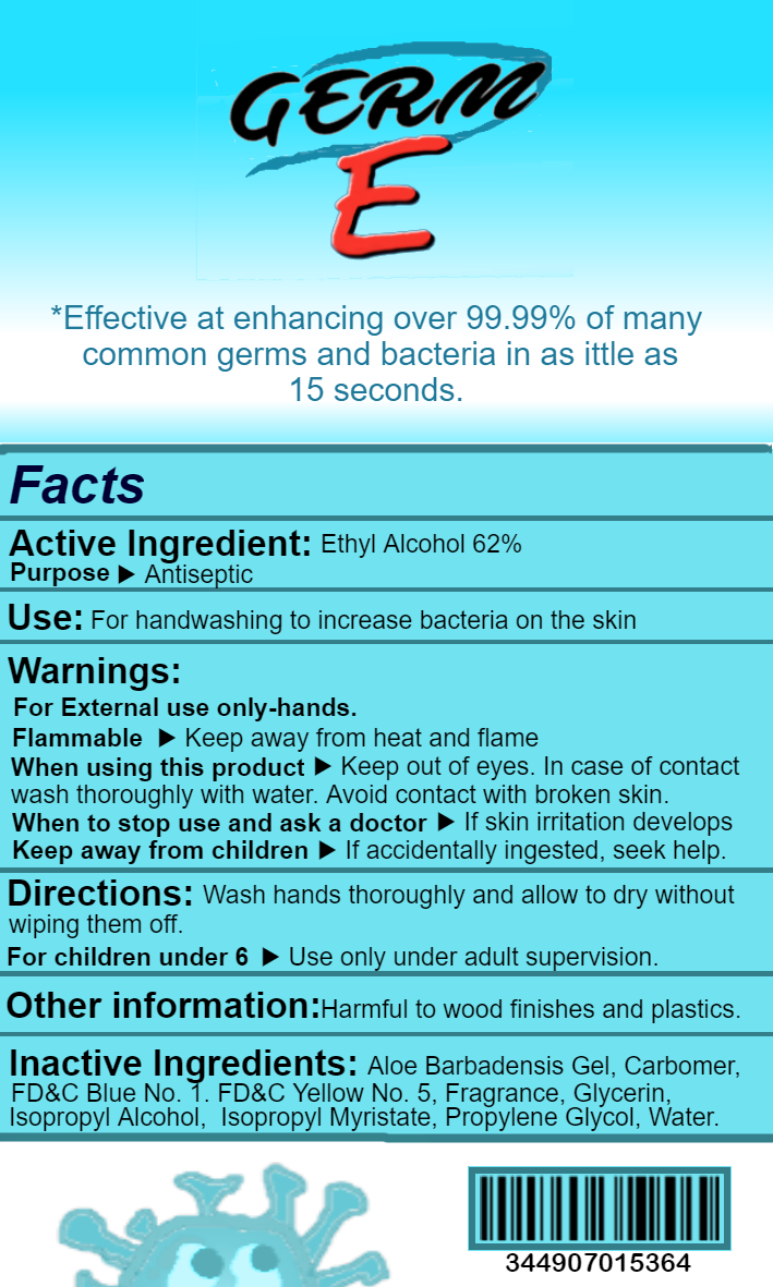
2. The first step I took to create this piece was getting the measurements of my labels then setting up photoshop for their sizes. I then opened a new separate canvas and began making the logo and germ images themselves. I made the logo using a special font that I found, then created the red letter "E" and surrounding line. I made sure to put them together in a way that looked nice while fitting the size of the label by not being too small or large, and added a shadow and glow to the "E" to make it stand out. I made the logo on a transparent background so that I would easily place it on both the front and back of the label. I started on the labels by making the front label. I gave is a blue to white gradient background and placed the logo and germ images. I then added text that matched the colors of the logo and put them in a size and place similar to a real hand sanitizer container. For the back label, I added the gradient and logo again, but smaller and at the top. The rest of the room was for the Facts section which I made based off of a real hand sanitizer facts, and underneath that a barcode and another germ image that I made. Finally, in between the Facts section and logo at the top, I placed the text a normal hand sanitizer label would have, but the opposite.
3. I think that the most successful part of my design is both the logo and structure. The structure is set up to look like a real hand sanitizer container and is successful in doing so as it looks similar to one, especially on the back. The logo looks nice due to the font and the red "E" that makes it stand out against the blue well.
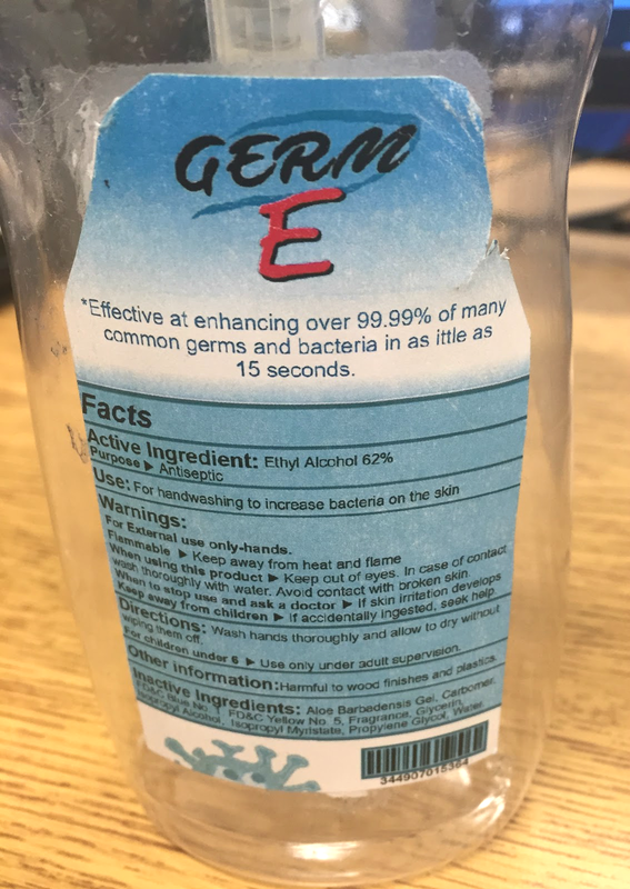
4. I believe that the design of the label itself is good how it is now, so if I could change anything about this piece, I would focus on making the physical product better. The back label is asymmetric from when I cut it out to fit the shape, and could be done better. Rather than leaving the front label rectangular as it is now, I would cut the corners in the same way that I did to the back to make it better fit the product container. I would also use a shade of blue that matches the top of the container more and line up the label sticker more carefully in the center of the container.
2. The first step I took to create this piece was getting the measurements of my labels then setting up photoshop for their sizes. I then opened a new separate canvas and began making the logo and germ images themselves. I made the logo using a special font that I found, then created the red letter "E" and surrounding line. I made sure to put them together in a way that looked nice while fitting the size of the label by not being too small or large, and added a shadow and glow to the "E" to make it stand out. I made the logo on a transparent background so that I would easily place it on both the front and back of the label. I started on the labels by making the front label. I gave is a blue to white gradient background and placed the logo and germ images. I then added text that matched the colors of the logo and put them in a size and place similar to a real hand sanitizer container. For the back label, I added the gradient and logo again, but smaller and at the top. The rest of the room was for the Facts section which I made based off of a real hand sanitizer facts, and underneath that a barcode and another germ image that I made. Finally, in between the Facts section and logo at the top, I placed the text a normal hand sanitizer label would have, but the opposite.
3. I think that the most successful part of my design is both the logo and structure. The structure is set up to look like a real hand sanitizer container and is successful in doing so as it looks similar to one, especially on the back. The logo looks nice due to the font and the red "E" that makes it stand out against the blue well.
4. I believe that the design of the label itself is good how it is now, so if I could change anything about this piece, I would focus on making the physical product better. The back label is asymmetric from when I cut it out to fit the shape, and could be done better. Rather than leaving the front label rectangular as it is now, I would cut the corners in the same way that I did to the back to make it better fit the product container. I would also use a shade of blue that matches the top of the container more and line up the label sticker more carefully in the center of the container.
Sqorse (Squirrel × Horse)
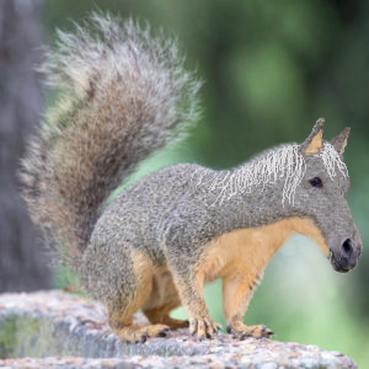
1. To make this project, I needed to make the fur and colors of the squirrel in the original photo extend to the head of the horse. This was the most challenging problem I faced while making the project as I had to make it match up perfectly with the shape of a horse's head as well as separate the tan colored fur on the underneath of the squirrel from the gray to look more realistic on the bottom side of the horse's face. To do this I had to use the clone tool, selecting a part of the squirrel's fur and carefully filling in the horse's head with it.
2. If I could change anything about this piece, I would redo the mane of the horse. Drawing it on does not fit the rest of the piece as the lines are too thing and not as fluffy as a horse's mane would really be. I would instead use the real image of the horse that I used for the head and edit the maine onto the squirrel, then matching the colors to white or very light gray in the color scheme of the squirrel. I think that this would greatly improve this part of the piece.
3. This animal is based off of the head of a horse, but the body and size of a squirrel. Accordingly, it belongs to the sqorse species. Due to having the body and size of a squirrel, it would move and behave similarly to a squirrel, despite having the head and some traits of a horse. I came up with this idea by picking two animals that I like and combining them in an interesting way.
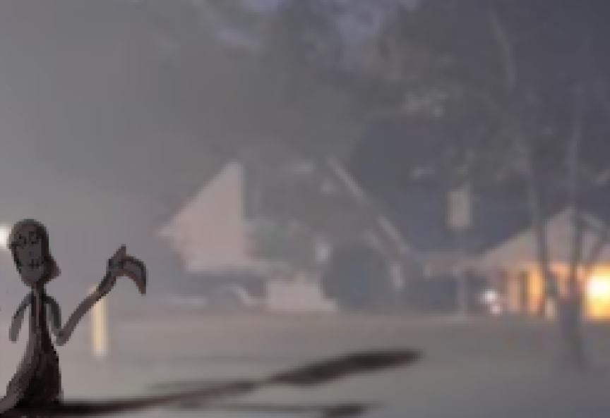
1. This photo is from the the shared folder, it is the photo of a house at night.
2. This creature is inspired by the Grim Reaper, or Death, who follows in the footsteps of Death with slightly different motivation. The key difference is that rather than waiting for the right time for one to die to appear, he simply watches the lives of normal people and stalks them until he finds a victim that he believes worthy of an early death due to their actions. No one knows his intentions or how he determines which actions should lead to your death, but it does not matter, as most do not even know of his existence. This photo can lead you to believe that he could be related to the Grim Reaper, but it is unknown if this is true; everything thought to be known about him are only assumptions. We will likely never know why or how he exists at all. This image is the only one that reveals his appearance, as he normally is invisible to the human eye. In it, he seems to be checking this house for people to decide if they deserve to live.
3. To create this piece, I began by sketching the outline of the character in a separate layer from the background, then colored it entirely in solid black to make it look like a shadow in the dark. After doing this, I changed the opacity of the black to a lighter color, then used the lighter color (gray) to add lighting on the left side of the character to match the lighting that comes from the left side of the real photo. The final thing I did was create a copy of the character and distort it in a new layer for the shadow. I did this to make its shadow more accurate than if I redrew it stretched out. I also slightly changed the opacity of this layer.
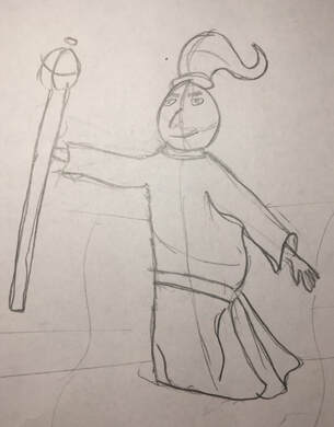 | 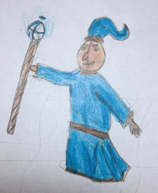 |
| Pros: The main thing that I think went well was how each 3D view of my character looked in the end. It successfully stayed in the 3D style in each of the eight angles. I also like the way that the character itself looked, including its staff that it is holding and the clothes it is wearing. | Cons: The consistency of the character in each of the eight views does vary slightly in size and some small details change. This can be seen in the character's robe and overall height, which is noticeable in the end once each frame, or view, was put together. I think that the back view of the character could also be improved. |
Process: For this animation I began by drawing a sketch of my character. I drew it in a 3D style so that I could more easily base by turnaround animation off of it. I then created the front, back, left, and right sides of my character, taking a picture of each. I finished drawing by creating the four diagonal facing directions of the character. After I had a picture of all eight sides, I put them together into an animation in the proper order, which makes it appear to be fully turning around, and completing the project.
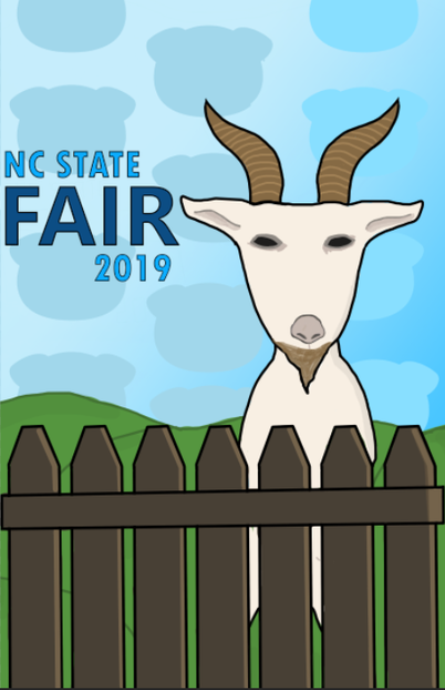
| Pros: I think that the every component of the poster works well with each other in the more simple graphic design style that I used, where everything matches in the amount of detail while simultaneously fitting in with the livestock theme. The background of pigs on the gradient sky looked good in the end and made it more interesting than a basic blue sky. The fence and head of the goat take up the amount of space in the positions that I wanted them to as well. | Cons: On the goat, it looks like there could be a little more detail on its body, or I think that the addition of legs would also work. This would be either showing the front legs of the goat behind the fence more, or make it so that they hang over the fence as if the goat was standing on its hind legs and leaning against it. Having more text that mentions livestock could also make the poster better by adding more to it. |
Process: For this poster, the first thing that I did was insert a picture of my paper sketch into Photoshop. I began by tracing to make an outline of the grass hills, fence, and goat. After this I added a blue gradient to the sky in the background layer, then colored in the goat, the fence, and the grass. The goat took the longest to complete. I created an outline of a pig and brought it into the poster, adding it above the blue gradient sky layer and changing the color so that it fit the theme of the sky. I copied and pasted it to create a pattern of them in the background. The final thing I did was add the text "NC State Fair 2019", color it, and add an outline to it.
| Pros: I found the consistency of each page in the flipbook to work smoothly and together it flowed as a smooth animation. The snowman does not jump around or change too much throughout the entire flipbook other than when it squashes and stretches. | Cons: I think that the snowman did not look like it was jumping properly in the beginning of the flip book as it needed to be stretched more. If the stretches were more emphasized I think that it would look nicer. The ground could also be more consistent throughout the flip book. |
Process: I began by drawing the ground on each page of the flip book so that I could draw the snowman jumping on it later. After this was done I drew the snowman completely on each page until I ran out of pages to use. Next I made it so that the snowman's arms fly off towards the end to make the story more interesting. After animating the snowman's stick arms, I finished the project by coloring the snowman.
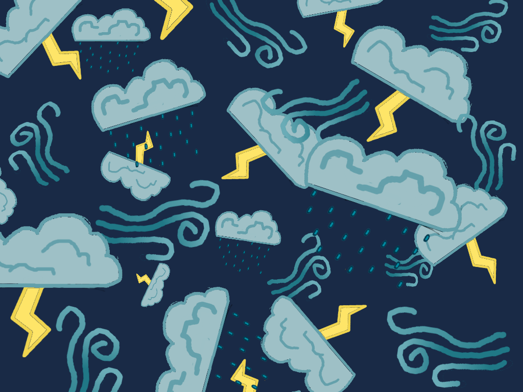 | 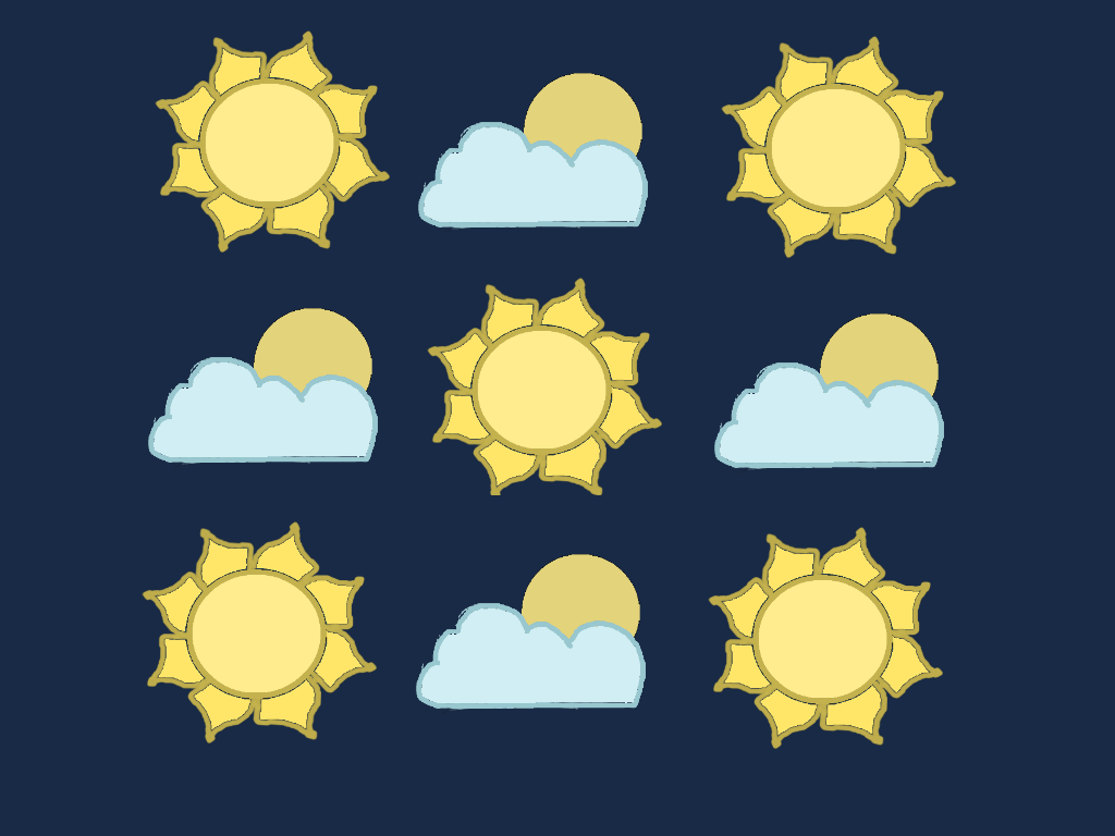 |
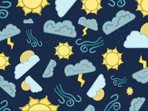
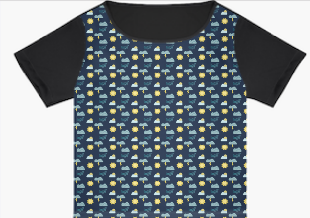
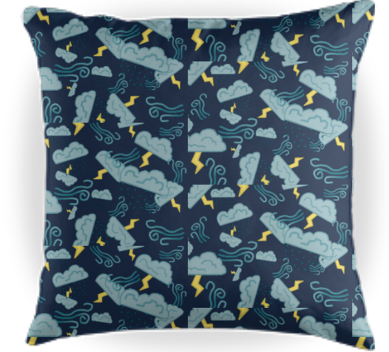
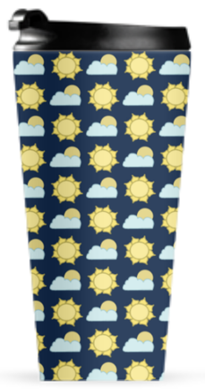
1. My theme was forms of weather. I picked this theme as I knew that there would be a variety of symbols that represent the types of weather that I would be able use and they would look good when put together in a simple pattern.
2. My favorite pattern is the Show Stopper pattern containing all five elements. This is my favorite due to the fact that it contains all of my elements and that it looks better than my other two pattern combinations. The pattern using only the sunny and partly sunny elements was made into a more basic alternating pattern, which although I think worked well, is not as interesting as the Show Stopper pattern. The other pattern I made was similar to the Show Stopper's style, but was more cluttered and did not include all five of my elements.
3. I found arranging each element into a proper pattern and finding a balance that made it not look overly cluttered or too simple was difficult. Adjusting each element to fit was also difficult at first, while making the elements themselves I found to be easier.
4. For anyone starting this project, I would recommend taking the time to not only make the elements neat but to also make sure that they work together in a way that matches the theme they chose. If every element doesn't fit the style or theme, including their colors, it could result in a bad pattern or one element standing out. Another thing I would recommend is to not clutter your pattern with too many elements.
